
favicon Image for Bookmark


Also, the .ico file should not be just one resolution. You can pack a .ico with several different resolution icons.
BTW, if anyone wants to suggest an image but doesn't have the ability to pack it into an .ico file properly, just post a 64x64 version and I'll scale it down an pack it for you.
Registered User
iTrader: (3)
Joined: May 2006
Posts: 934
Likes: 4
From: Charlotte, NC and Central Virginia
haha that's exactly what i thought it was!
I assume if enough people like it better, they'll say so either in this thread or by PM.
IB Staff

Joined: Feb 2010
Posts: 660
Likes: 41
From: Barrie, ON
Ok, here's what I have:

http://www.nfspmotorsports.com/random/favicon.ico
It's multi-resolution too. So it'll make a clean image at 64x64, 48x48, 32x32, 24x24, and (of course) 16x16
http://www.nfspmotorsports.com/random/favicon.ico
It's multi-resolution too. So it'll make a clean image at 64x64, 48x48, 32x32, 24x24, and (of course) 16x16
thoughts?
Registered User
iTrader: (3)
Joined: May 2006
Posts: 934
Likes: 4
From: Charlotte, NC and Central Virginia
i like that idea... only problem i see is a lot of people have the favicons of their bookmarks placed against a grey background (i.e. the default color of firefox) so with a transparent background, and a grey-ish logo, it may turn out nearly invisible
so with that in mind, maybe make the background transparent, but also a thin black outline around the existing Mt Fuji
Joined: Jan 2004
Posts: 21,095
Likes: 47
From: Toronto, GTA north
With a light colored or silver logo, I think you need a background of some sort to give it contrast.


Everyone is going to have a different color background or skin in their browser. The background color of the favicon should be the opposite of the actual favicon image color so that it will always be 100% visible. Web design 101, especially with font colors.
The one NFSP G35 came up with is most appropriate IMO. Thanks for caring enough to fix it staff!!

^+1 Yes, thanks for caring Mods.
This is what it looks like in Chrome... kind of like a butt... or scuba goggles... a black background, IMHO, would be a step in the right direction.
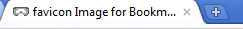
This is what it looks like in Chrome... kind of like a butt... or scuba goggles... a black background, IMHO, would be a step in the right direction.