Mobile-Detailing in the GTA


#437
 02-25-2007, 03:18 PM

Kevin must have cloned himself.
http://forums.corvetteforum.com/show....php?t=1633240
Kevin, with only 24 hours in a day where I live, how do you get around so much? There must be a couple of copies of you.
Kevin, with only 24 hours in a day where I live, how do you get around so much? There must be a couple of copies of you.
#438
02-25-2007, 04:42 PM

Originally Posted by G-Force
http://forums.corvetteforum.com/show....php?t=1633240
Kevin, with only 24 hours in a day where I live, how do you get around so much? There must be a couple of copies of you.
Kevin, with only 24 hours in a day where I live, how do you get around so much? There must be a couple of copies of you.

#440
02-25-2007, 06:46 PM
#442
03-07-2007, 05:14 PM
Hey guys, wanted some opinions. I need to order more business cards (placed an order last month with vista print, they screwed up big time, now I get a bunch free, yay). My current card looks like this:
back is on the left, front on the right.
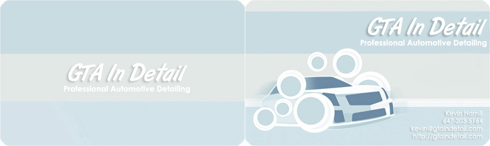
I like it, it matches my website, it's fairly generalized and simple (I like simple), it doesn't have a real car on it though which has been a criticism.
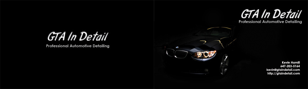
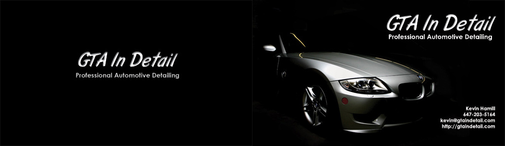
I thought maybe I would change it up a bit, and I came up with these. If you like them let me know which you like better. If you hate them, let me know that too. Yes, I realize they are both BMWs. I don't have any cool arty shots of G35s. :/
back is on the left, front on the right.
I like it, it matches my website, it's fairly generalized and simple (I like simple), it doesn't have a real car on it though which has been a criticism.
I thought maybe I would change it up a bit, and I came up with these. If you like them let me know which you like better. If you hate them, let me know that too.
Yes, I realize they are both BMWs. I don't have any cool arty shots of G35s. :/
#444
03-07-2007, 05:35 PM
In both the new ones the printing stands out more, it is more legible because of the dark background.
I like the new ones better although the background could be a little lighter to show more contrast with the cars but still dark enough to let the printing stand out.
Hope that makes sense.
I like the new ones better although the background could be a little lighter to show more contrast with the cars but still dark enough to let the printing stand out.
Hope that makes sense.
#445
03-07-2007, 05:39 PM

#446
03-07-2007, 06:04 PM
#447
03-08-2007, 01:33 AM

Registered User
Join Date: Mar 2007
Location: Toronto
Posts: 49
Likes: 0
Received 0 Likes
on
0 Posts
I've got a soft spot for the first one. I really like the bubbles, seriously, and it really works with the font and the shading. The car looks like a Caddy CTS though which is good and bad.
But the new ones will probably win you new business and convey a upscale image, people tend to like slick and I agree they offer an example of your work vs. the graphic.
Of the new ones I prefer the second one because the photo really accentuates the lines of the car well. It has a stalking feline quality and the headlights add colour with the lighting effects on the hood due to the sweet detail job


#450
03-08-2007, 10:10 AM
I agree it might be time to move to a new look. Your original one gives a professional and fun look. That conveys a feeling of clean because of the light colouring and what I see as soap suds.(I might be the only one that sees that though) To me having a generic car is never a bad thing unless you are specifically targeting a different group.
In any case the black and slick images gives a sleek professional upscale look on the new cards. I prefer the second image (Z) because of the lighting and brighter presentation of the car image. The fonts and images are all nicely balanced on that one. On the second image having the car pointing to the centre works much better to focus your eye to your logo and signature etc. If you were using the first layout you should flip the car so the typography would be on the left and the car on the right.
You'll need to ensure a very high quality card stock due to the black colour to minimize the rub off. I don't know if there is a heat set process they use in business cards or not.
G/L
Have you thought of creating a slogan or mission statement that could be included on your cards?
Last edited by RBull; 03-08-2007 at 10:13 AM.