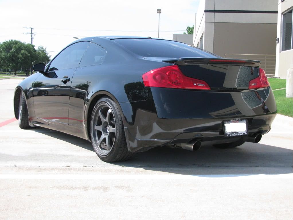
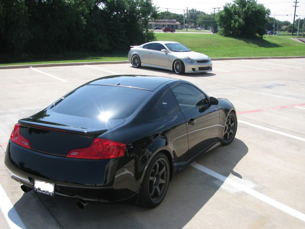
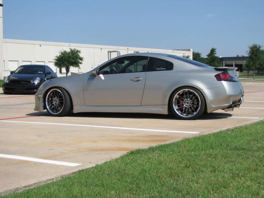
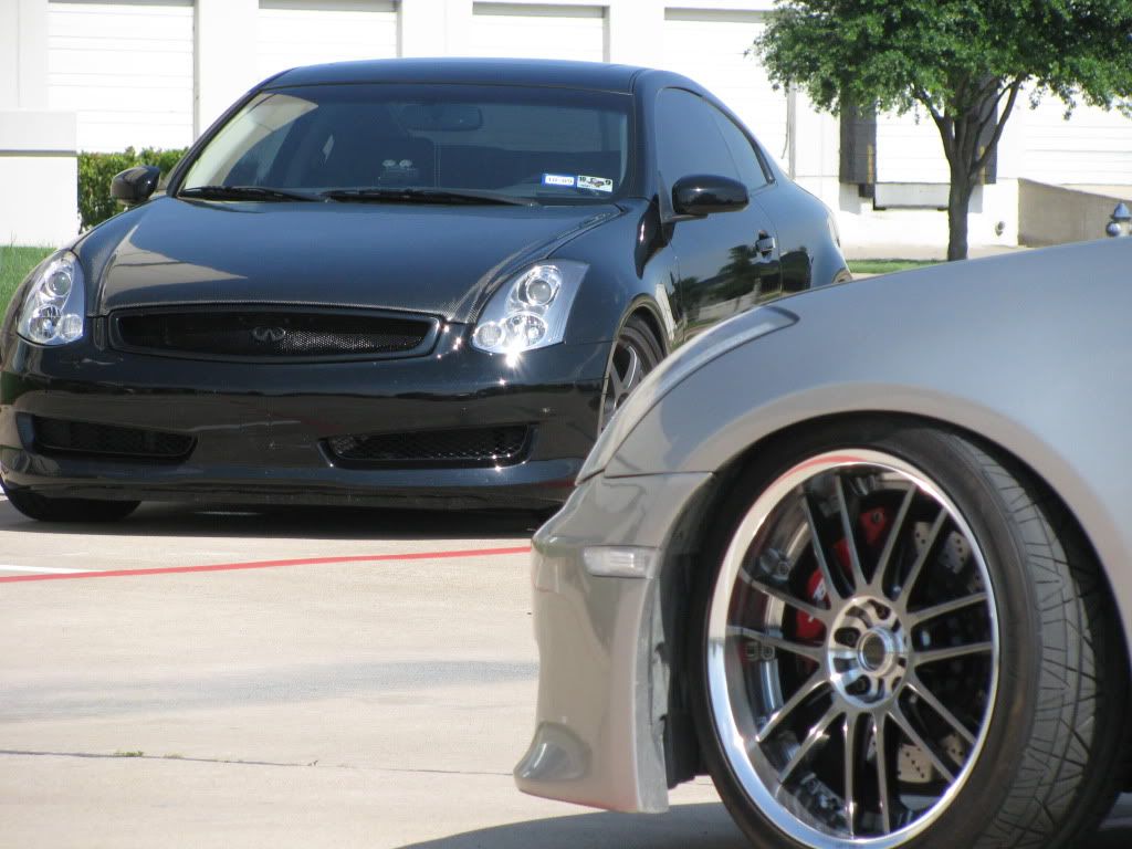
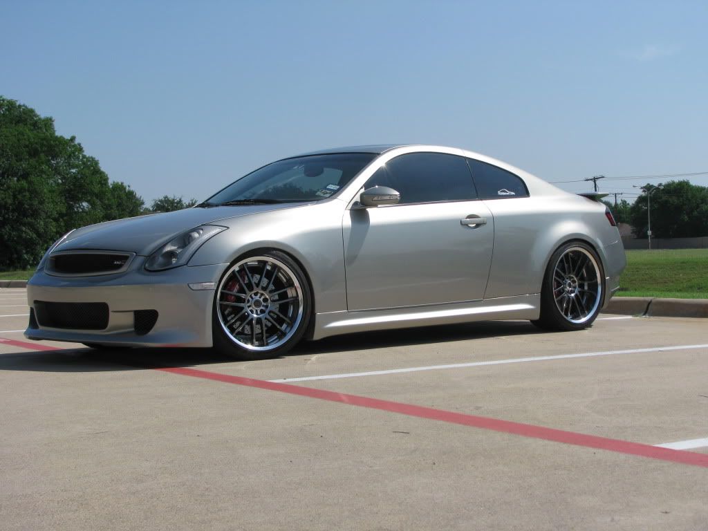
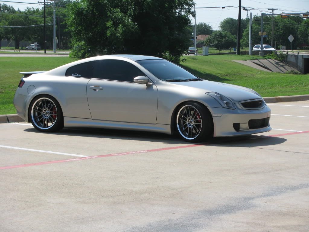
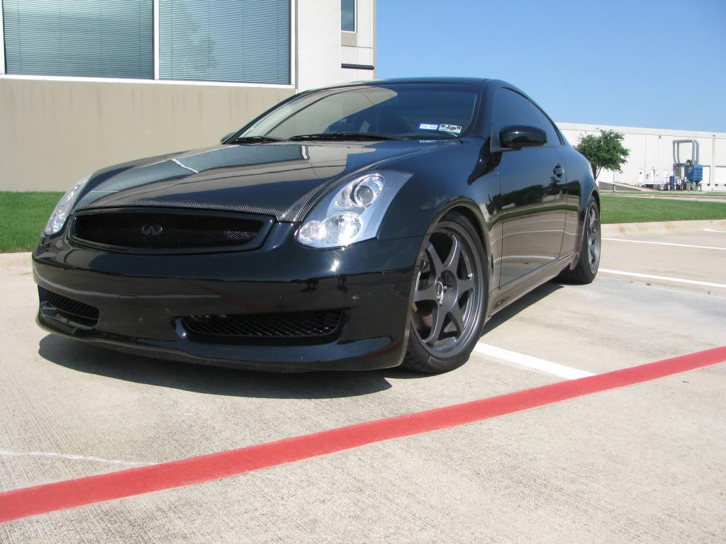
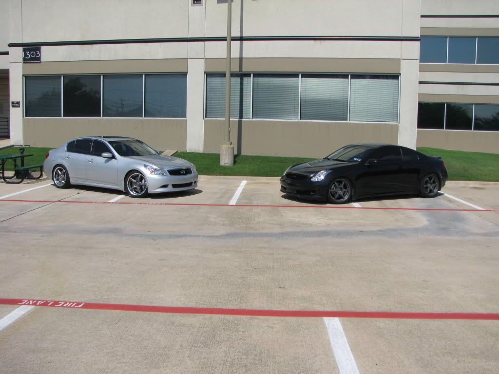
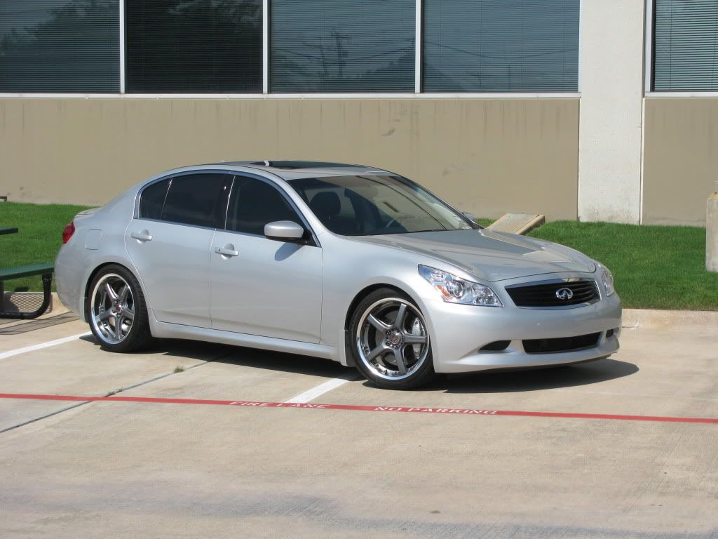
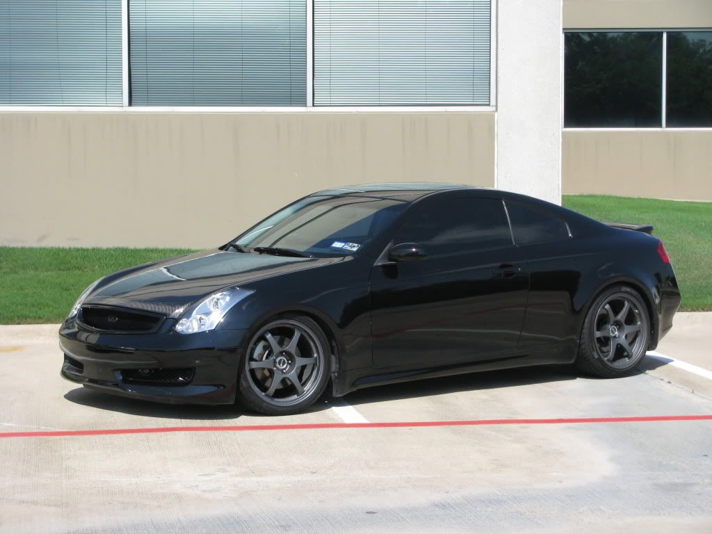
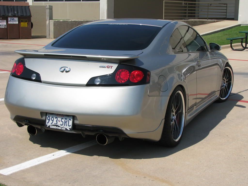
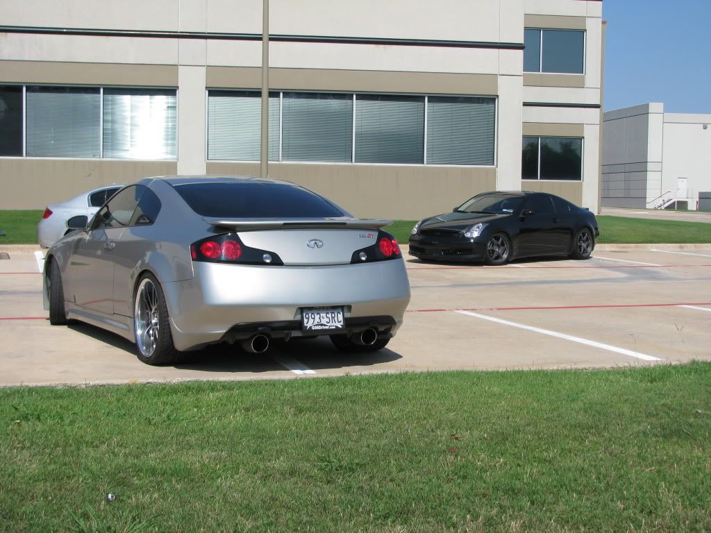
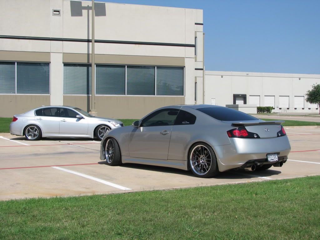
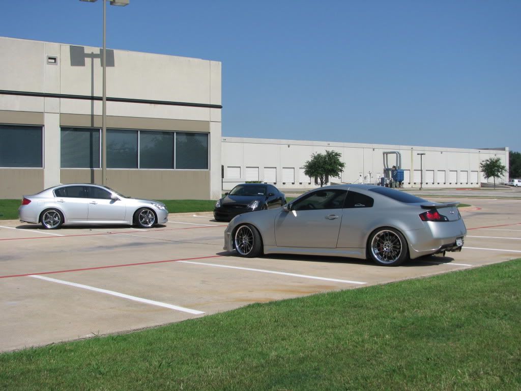
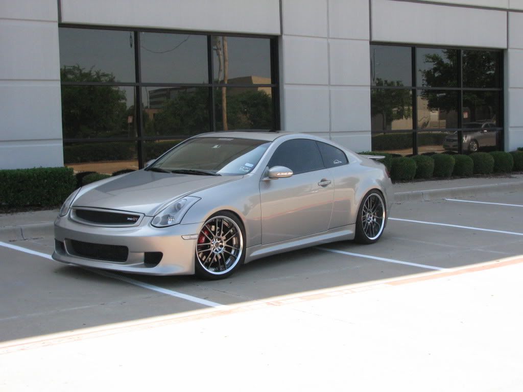
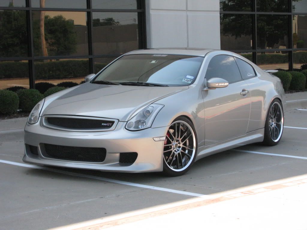
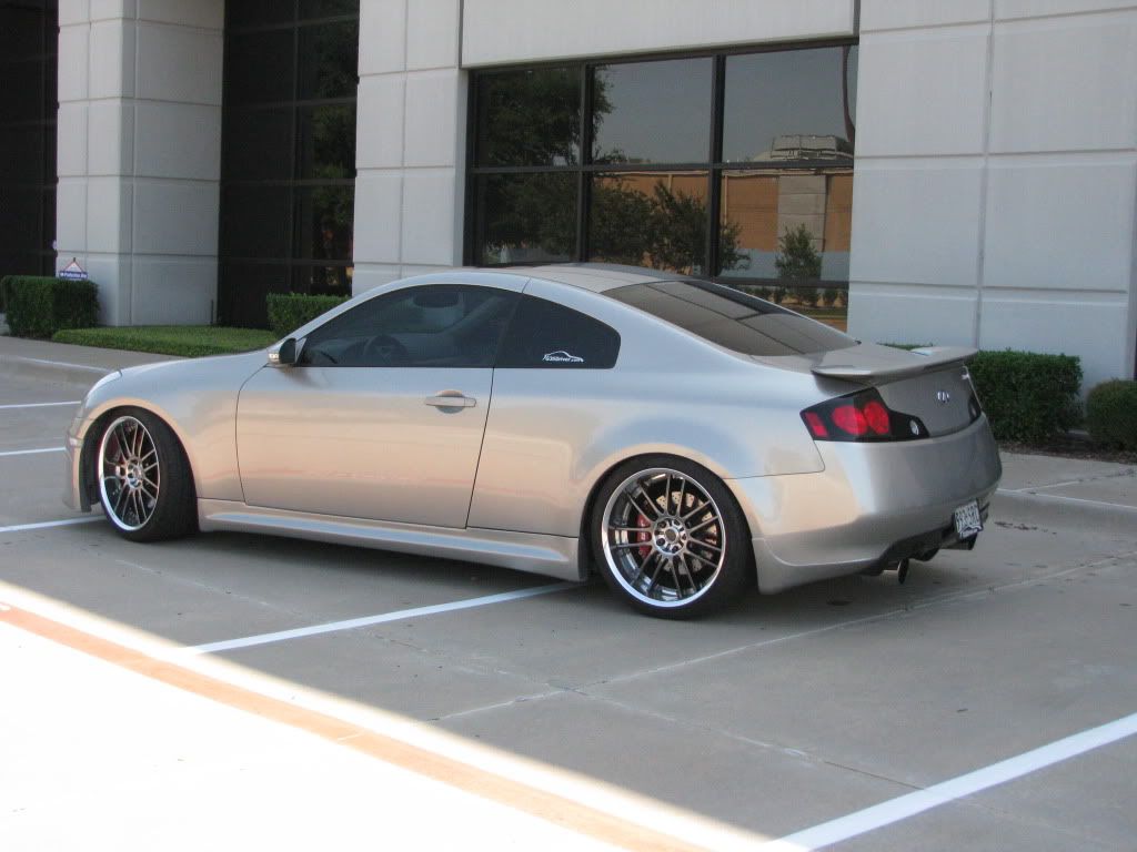
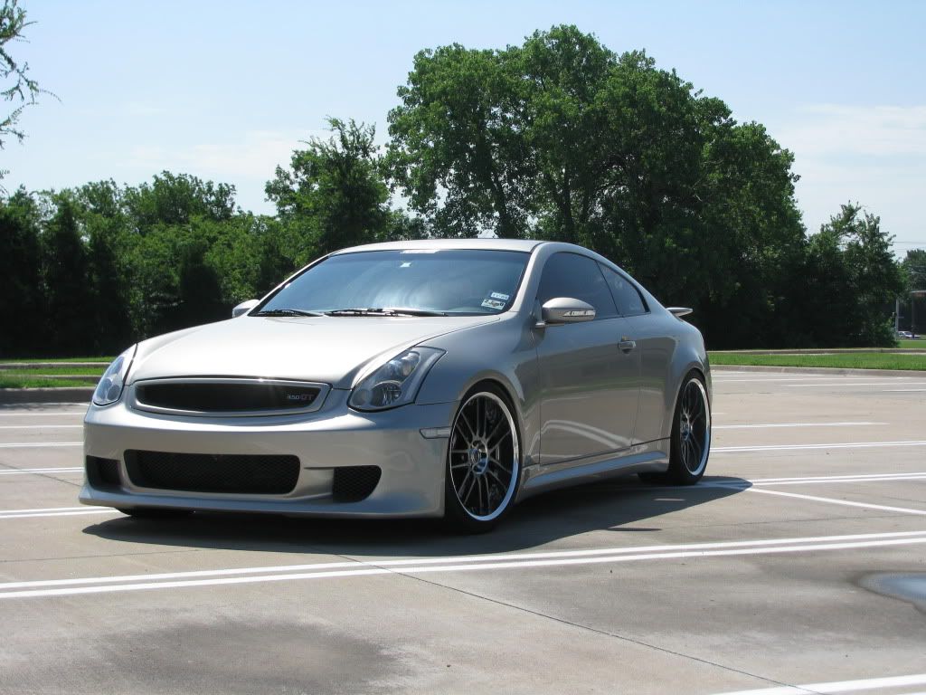
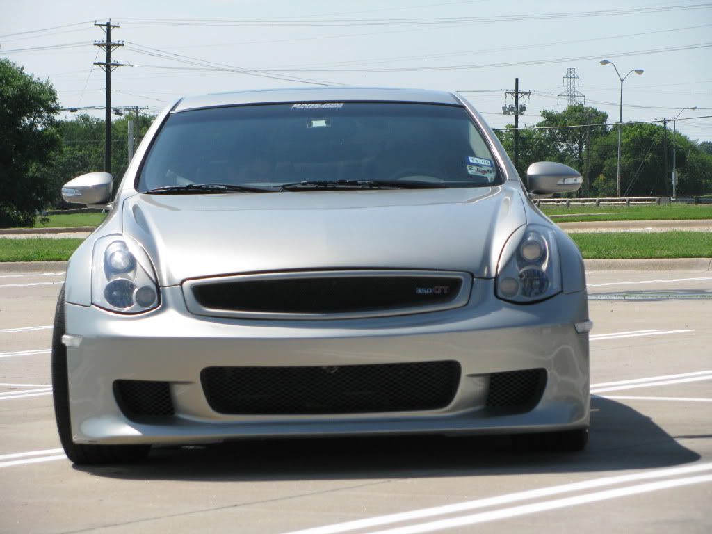
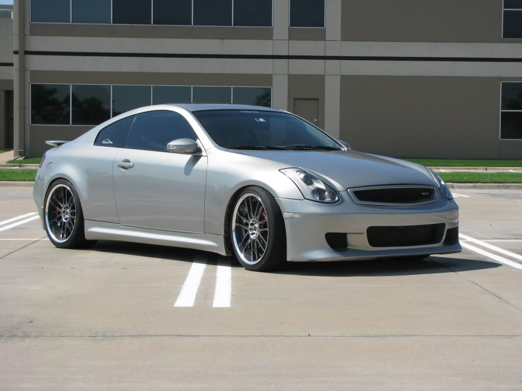
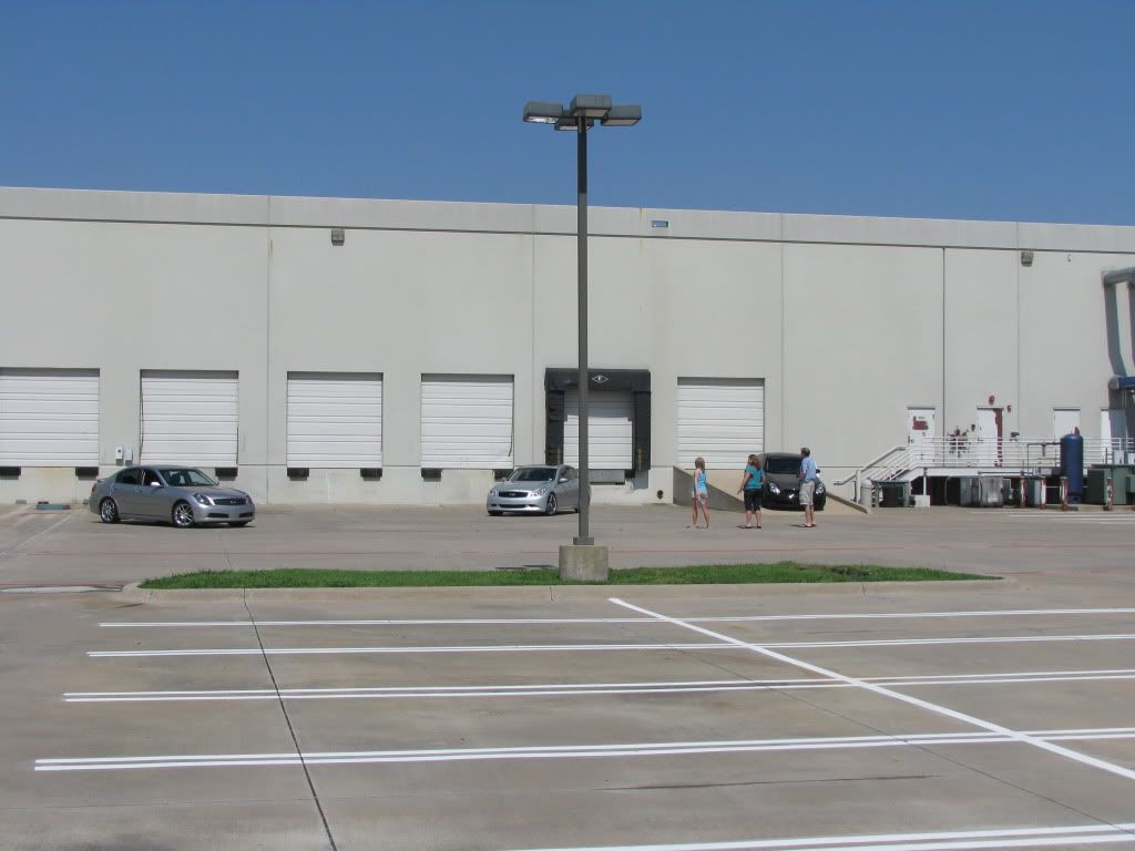
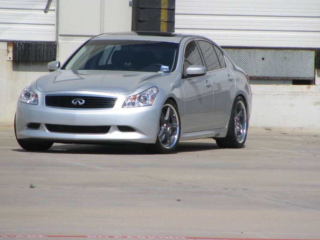
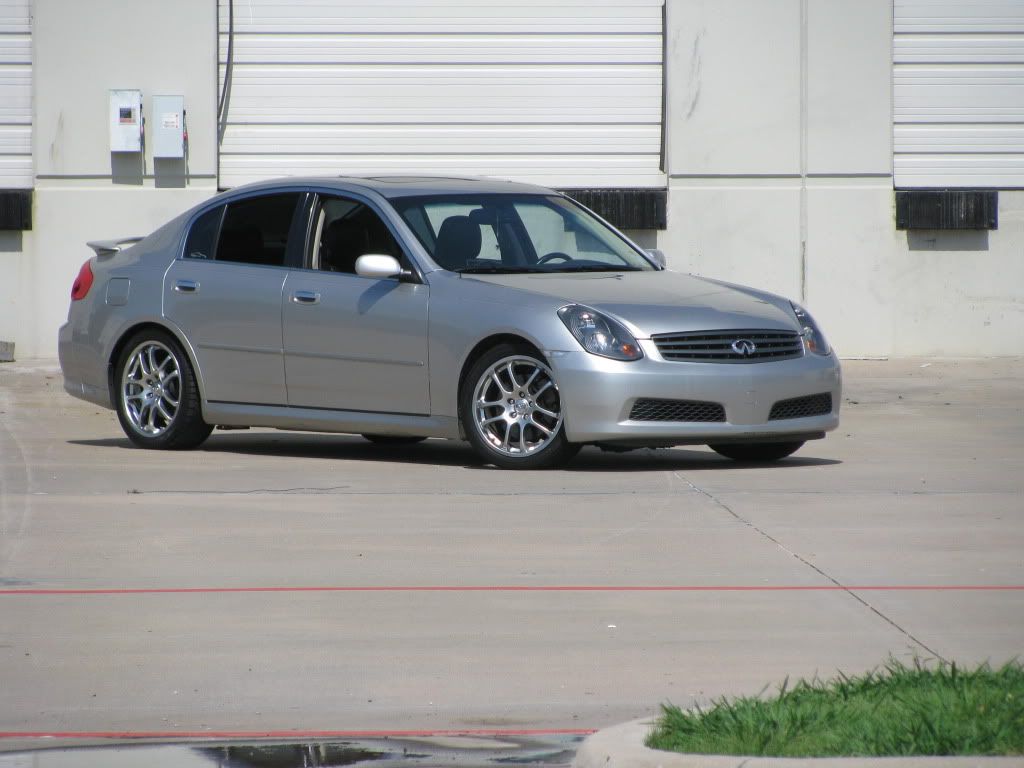
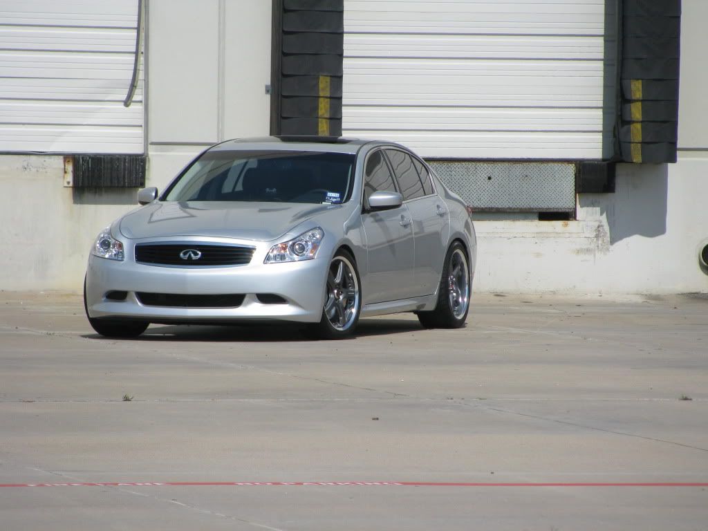
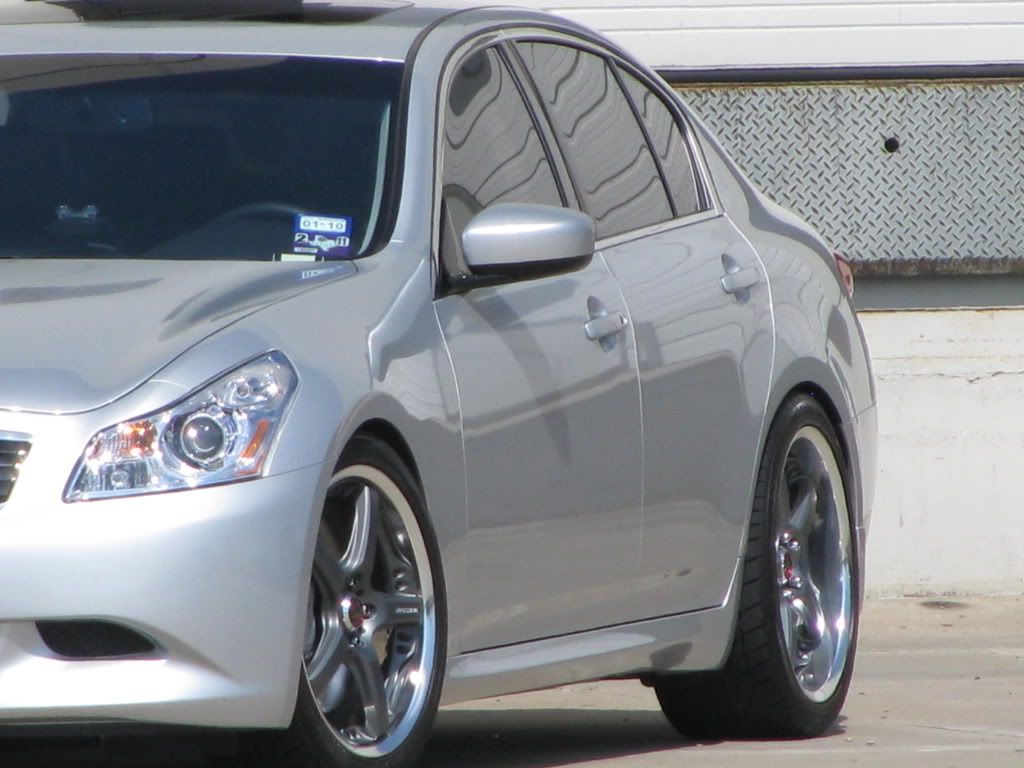
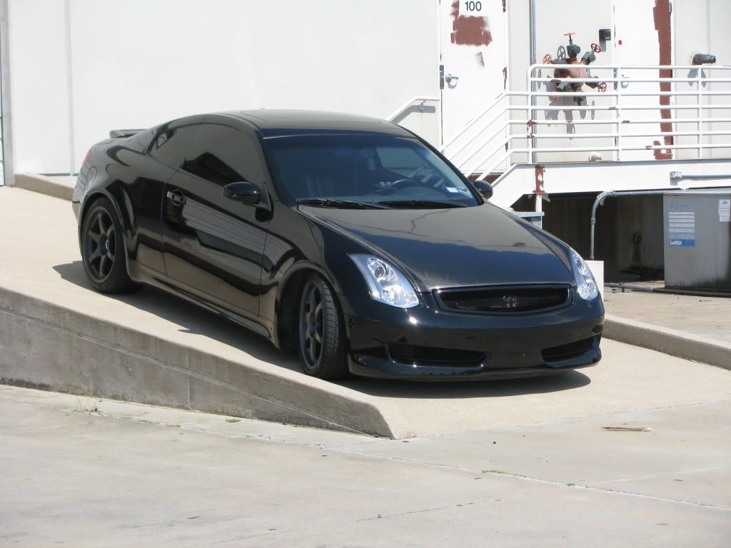
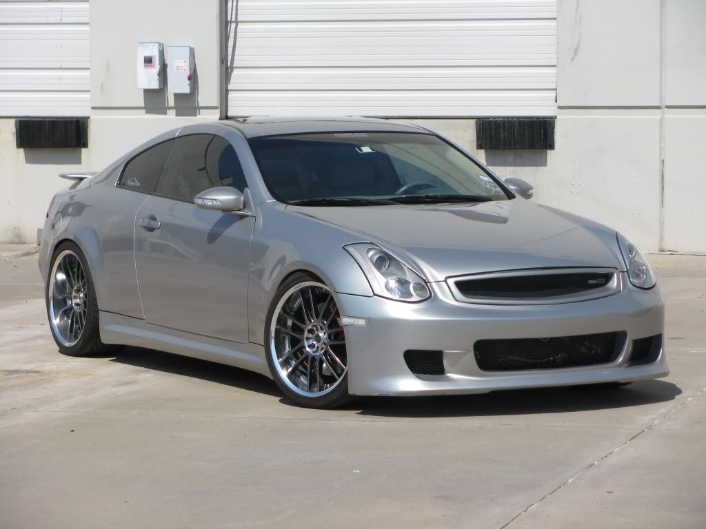
PICS: June Photoshoot (June14) session...
#1
#7
Trending Topics
#10
if you don't mind.. I'd like to help out as well.. I think that was the whole point of this "meet" was for photographers, aspiring photographers, or just people that wanted to learn to take better shots to get together, and shoot together and trade tips and ideas..
With all the people that were signed up.. I felt it was kind of getting away from that theme, so that's why I removed myself.. I got the call from Chris that morning that only 4 people showed up, but by then I'd already made plans w/ the fam.
But I'd like to help critique if you guys are open to suggestion.. However, I think the proper mindset has to be understood that it's all creative criticism, not hating or bashing.. It's all toward trying to make someone better or even spark thought of why something was shot in a particular manner.
#11
#12
w/out seeing your photos (because they're blocked here at work), here's what I have to say about your comment... How large your cam is, or it's features have nothing to do w/ composition.. Where you place your subject in it's setting, or the setting that is chosen for your image has nothing to do w/ the amount of megapixels your camera CMOS can produce. That's simply resolution. More does not equal better.. In fact, I still shoot w/ my Canon 20D which is an 8.3 MP camera.. Most point and shoots now days are around 10mp or more.. However, it's the setting and composition that really defines a good shot, not necessarily the camera that is used..
I'll look on my phone at the site and see if I can view your pics.. Anxious to see what you got.
EDIT: Honestly, to take your pics to the next level, lighting is equally as important.. Shooting outside shots at the proper time (when the sun's not directly overhead) is an underestimated asset to your pics.. If you're going to shoot outside, you want to shoot in the morning or as the sun's going down.. Not in the middle of the day. You get harsh shadows that you cant' compensate for (unless you have reflectors or external flashes).. I think when waijai and I went to shoot, that was the major player in the quality of shots we got.. It really just sucked the life out of most of the shots we took.. No matter how good everything else is, you can't truly appreciate the subject if the lighting is not flattering..
#13
^ +1
From my little less than 1 yr of experience with photography, this is what I think...
Its all about the lighting and composition. The composition includes the "space".
When you are taking a picture, dont just look at the subject or the point of focus (for ex the car), look whats behind it, look whats on the sides, look what else is in going to be part of that picture (aka the space).
The space can make a world of difference.
#14
One basic photography principal is the rule of thirds.
taken from Wikipedia:
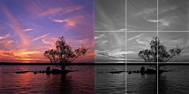
This photograph of a sunset taken in the Thousand Islands region demonstrates the principles of the rule of thirds
taken from Wikipedia:
The rule of thirds is a compositional rule of thumb in visual arts such as painting, photography and design.[1] The rule states that an image should be imagined as divided into nine equal parts by two equally-spaced horizontal lines and two equally-spaced vertical lines, and that important compositional elements should be placed along these lines or their intersections.[2] Proponents of the technique claim that aligning a subject with these points creates more tension, energy and interest in the composition than simply centering the subject would.
The photograph to the right demonstrates the application of the rule of thirds. The horizon sits at the horizontal line dividing the lower third of the photo from the upper two-thirds. The tree sits at the intersection of two lines, sometimes called a power point. Points of interest in the photo don't have to actually touch one of these lines to take advantage of the rule of thirds. For example, the brightest part of the sky near the horizon where the sun recently set does not fall directly on one of the lines, but does fall near the intersection of two of the lines, close enough to take advantage of the rule.
The photograph to the right demonstrates the application of the rule of thirds. The horizon sits at the horizontal line dividing the lower third of the photo from the upper two-thirds. The tree sits at the intersection of two lines, sometimes called a power point. Points of interest in the photo don't have to actually touch one of these lines to take advantage of the rule of thirds. For example, the brightest part of the sky near the horizon where the sun recently set does not fall directly on one of the lines, but does fall near the intersection of two of the lines, close enough to take advantage of the rule.

This photograph of a sunset taken in the Thousand Islands region demonstrates the principles of the rule of thirds
Utilizing
The rule of thirds is applied by aligning a subject with the guide lines and their intersection points, placing the horizon on the top or bottom line, or allowing linear features in the image to flow from section to section. The main reason for observing the rule of thirds is to discourage placement of the subject at the center, or prevent a horizon from appearing to divide the picture in half.[3]
When photographing or filming people, it is common to line the body up with a vertical line, and having the person's eyes in line with a horizontal one. If filming a moving subject, the same pattern is often followed, with the majority of the extra room being in front of the person (the way they are moving)
#15
Yash, thanks... I also think your pics speak to your understanding of positive and negative space.. Your latest shots w/ you and BMoon's rides are one of my fav complete shoots I've seen thus far on this forum.. You definitely exhibit more than a year's worth of experience.
I think Yash's shoot is a perfect example of how setting should accentuate the personality of a specific car..
Yash's Shoot
So many times I see an inappropriate setting for a car based on how the exterior of the car is modified.. I think that was what waijai was talking about when he was saying that he didn't want his car shot at a "park".. Not that it couldn't be made to look good.. But that's not the "personality" of his ride in his eyes..
Good add waijai.. The rule of thirds is the most commonly used law in photography.. I think that because we have such large subjects we should also think about natural framing as well.. Utilize your surroundings to lead the viewer's eye to what you want them to see first.. As an exercise, close your eyes, and then open them and determine the natural path that your eyes take when viewing a picture.. Does it start in the lower left corner, and move up to the middle? What's it's natural path.. Your pic should be composed to lead the eye right to the subject.. If there's something that distracts the eye from the subject, then recomposition may be needed or post production should be used to remove the distracting object (poles, power lines, parking lines, etc)..
Last edited by twalls; 06-16-2009 at 12:33 PM.


