
View Poll Results: Do you like the Re-Design?


Voters: 176. You may not vote on this poll
new forum layout.


The white font with blue background where it says account over to Log Out and at the top of the thread are blurry. At least on Google Chrome.
Oh not a fan of that red coupe either. Whats up with that trunk deck? (Amongst other things?)
Oh not a fan of that red coupe either. Whats up with that trunk deck? (Amongst other things?)


Something that I did notice about distortions are the images that you choose to be your album cover in your profile's garage.
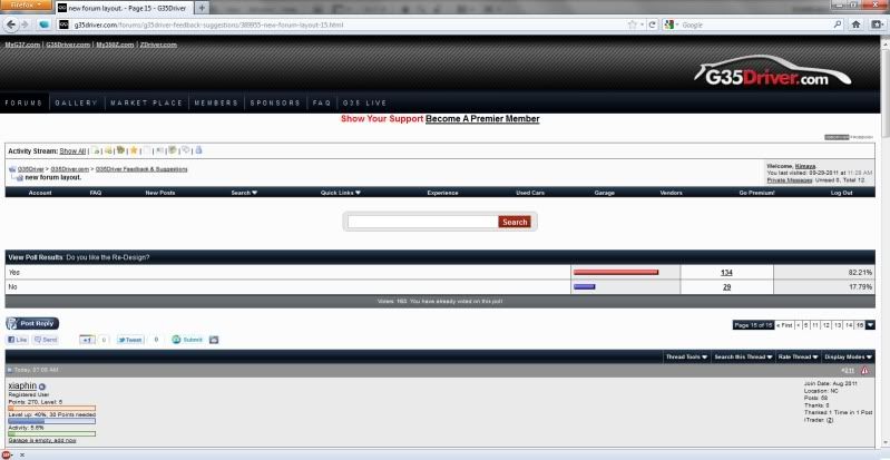
Let me enclose a screenshot. Hold up!
Edit: Attaching the file since photobucket likes to resize images that are larger than 1240x800 or whatever the hell it is.
Edit again: FML, driver does it too. I guess forums and such don't like 1680x1050 images.
Let me enclose a screenshot. Hold up!
Edit: Attaching the file since photobucket likes to resize images that are larger than 1240x800 or whatever the hell it is.
Edit again: FML, driver does it too. I guess forums and such don't like 1680x1050 images.
I hadn't noticed that before.


Registered User
Joined: Mar 2011
Posts: 77
Likes: 0
From: NorCal
I like the new layout much better than the old one but I don't particularily like the cars in the top banner. Nothing against the cars; they just feel like they were plopped in there with strange sparkles... o.O
Different banner, larger search box XD, and other misc. changes... like baby blue reply buttons >.>
Different banner, larger search box XD, and other misc. changes... like baby blue reply buttons >.>


Thread
Thread Starter
Forum
Replies
Last Post